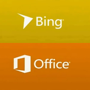
Microsoft’s creative team recently spoke of re-imagining the brand, bringing all native software and apps into sync with the fluidity and flow of recent incarnations of Windows 8 and Windows Phone operating systems. During the talk the company was kind enough to reveal future concepts for reworked logos for both Microsoft Office and the Bing search engine.
Design Managers Todd Simmons and Albert Shum unveiled the new simplistic but sharp designs for Office and Bing referencing Nike and saying ‘When you experience the Nike brand in whatever form you may experience it, there’s always a ‘Nikeness’, right? You can certainly see it without the logo”. And this is certainly an idea that is clear to see in the work they’ve been doing.
An example of Microsoft’s recent and future rebranding exercises that we as consumers may have witnessed will be in the switch from Hotmail to Outlook as the web-based email standard for Microsoft users. A simplistic but bold font in a single striking colour or background tile is becoming a recognisable theme in all software and apps from the Washington-based computing company.
These are early steps in Microsoft’s plan for what it refers to as “the alignment of design and marketing, product and brand harmoniously at a massive scale”. Next up for a reimagining looks likely to be the Xbox brand, with the next generation console getting an official announcement on May the 21st we shouldn’t have to wait long to find out if a recent logo leak is the real deal.
Let us know your thoughts by adding a comment below or via our @Gadget_Helpline Twitter page or Facebook Page.
You can also stay up to date with our YouTube, Tumblr and Instagram pages.

